The Corner Hotel wanted a fresh set of print materials to brighten up their spaces and improve the guest experience.
We were asked to design new menus, roller banners for the reception and brand new “do not disturb” door signs. The idea was to keep everything looking modern, welcoming, and in line with the hotel’s boutique vibe, while making sure it was practical for everyday use.
The Strategy
The goal was to create print materials that felt cohesive, modern, and reflective of The Corner Hotel’s boutique personality. We focused on clean layouts, bold typography, and a warm, inviting colour palette to keep everything consistent across menus, roller banners, and door signs.
Each design was crafted to be both practical for everyday use and visually engaging, helping to enhance guest experience while subtly strengthening brand presence throughout the hotel.The new print designs for The Corner Hotel brought a fresh, modern feel to both guest rooms and shared spaces.
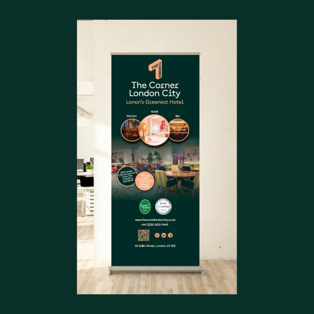
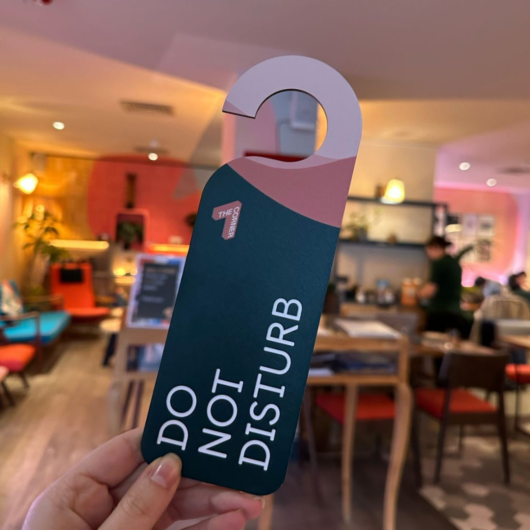
The Results
The bold, playful, wooden “do not disturb” signs quickly became a guest favourite, we created a design purposed for wood aligned to The Corner’s sustainability values.
While the updated menus added a clean, easy-to-read layout that complemented the hotel’s relaxed, boutique atmosphere. Roller banners in the lobby and event areas helped lift the overall look, making promotions and announcements feel more polished and on-brand. Altogether, the new materials added thoughtful, stylish touches that enhanced the guest experience and reinforced the hotel’s unique character.