Develop a logo for NetOrca’s AI add-on, the ‘NetOrca Pack.’ The logo should align visually with the existing NetOrca brand while also functioning effectively as a standalone mark.
The Strategy
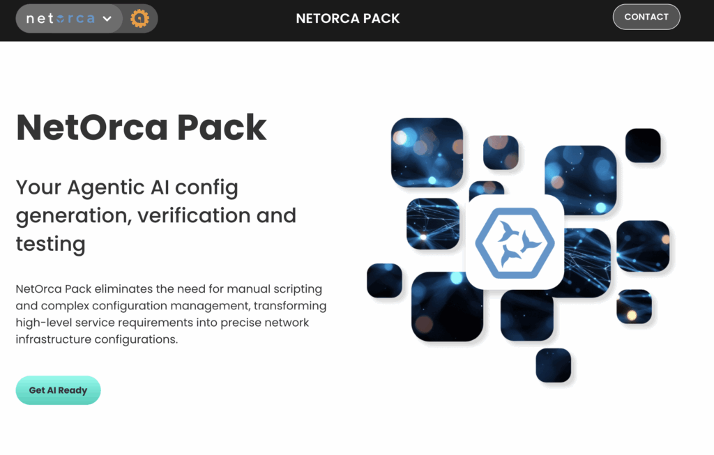
Our approach to developing the NetOrca Pack logo focused on extending the existing NetOrca visual language while establishing a distinct identity for the AI add-on.
We began by extracting the brand’s core design elements—its rounded geometry, soft line weights, and signature blue—to ensure consistency and recognizability. From there, we introduced a new symbol built from three stylised orca fins arranged within a hexagonal frame, a shape chosen to subtly reference modularity, technology, and structured intelligence. This allowed the mark to feel inherently connected to the parent brand while standing confidently on its own. The integrated fin icon within the wordmark further ties the system together, creating a cohesive brand extension that communicates both innovation and continuity.